Saturday, 5 April 2014

20140405 Final Project Review - Style of design

My design for the final project mainly focus on the figure and slogan.
But I took some designers design as example and try to use the elements in their design to integrate into my work.
Apart from Otto Neurath's isotype design, I also do some research on 'Peter Saville' and 'The Designers Republic'.
Peter Saville is an English art director and graphic designer.
From my point of view, he used very strong color and make a comparison on his design, but viewers would not lose the focus because he still keep balance on scene.


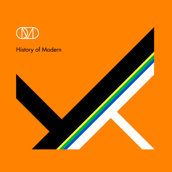
This work, 'History of Modern' is an album cover and really impressive.
He create the great balance on the main figure and the background color he use would not be seen too exaggerate or too eye-catching. 
In fact, it perfectly mix together.

On the other hand, to make the whole work seems to be vividly.
I take 'The Designers Republic' as example when I do my design.
The work that 'The Designers Republic' done is like the main graphic corporate with logo, and also mixed some Japanese anime with a postmodern tendency.


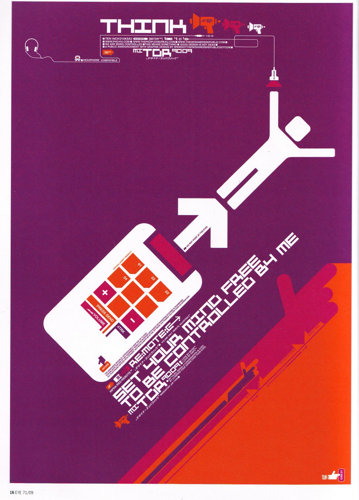
This is the work I found which is quite remarkable. 
Because the man in poster can catch the spectators attention, big move of man and opposite color is the point that the man could stand out.
Moreover, the color they used in this work is the combination of purple, dark purple and orange. 
I think the use of colors is quite bold but would not be odd for viewers.

I think my work is the mix of this three designers (Otto Neurath &Peter Saville &The Designers Republic).
I used great color contrast, iconic figure and balance screen to create the attention for viewers. 
What is more, I also use slogan to reflect on my graphic design to reveal and emphasize the topic of work.


Friday, 4 April 2014

20140404 Draft - CD design

This post should be post in earlier date but I always forgot it. Hence, this is the post which talks about some inspirational design from others and my draft.
-----------------------------------------------------------------------
The CD cover design was inspired by David Report.
Davide report is a blog for recording down different kinds of design, and this blog is owned by David Carlson.
David Carlson is an influential facilitator, cross-polinator, and design thought-leader. He provides bespoke solutions based on his knowledge in strategies concerning design, innovation and brand development.
In addition, he is the author of Make Design Matter.

He wrote the reports for the design competition to make a CD design which needs to incorporate the hole.
He displayed series of work on CD cover. (The link of the work: The hole in the CD)


Occasionally, I saw the third one on the google, and this kinds of CD design gave me a lot of ideas about how to use the hole.
Moreover, I found that the third one quite feat with my slogan.
So that I used the earth as a picture around the hole.
And I make my orange man push it.


20140404 Final Project Review - Video (NBA "Where Amazing Happens" commercial) & NBA logo


Apart from the Nike advertisements, this commercial video is another reason why I want to create the slogan within the iconic logo.
This CM create kinds of tough atmosphere for the basketball.
Within the slogan, it makes audiences who watch the video really can get involved in and also get the inside emotion with basketball.
Moreover, at the end of the video. It shows the NBA logo with the slogan "Where amazing happens" to reveal the whole theme again.
I personally quite like the way they do,and I believe that the audiences could  get the intended message.
Thus, that is why I did my best on this series of design, because I want to deliver same kinds of faith through the figures to viewers.

20140404 Presentation - Davide Carson

Our presentation was introducing one of great designer, David Carson, and here is the information about him. (Take from our presentation slides)

1.Bio:
-Born: September 8th,1954 (age60) Texas, United States
-Field: Type+Graphic Design

2. Ray Gun:
-Published in 1992- Carson was founding art director
-Distinct experimental typography
-He left three years late, but the chaotic style still very much influenced the artistic style of the magazine.

3. Features
-Emphasis on words/type rather than images
-Simplicity & minimalistic style
-Use of emotion (e.g. Dingbat font)

4. Cultural Impact & Public Opinion
-Love/hate reaction
-Merging of design & content= strong communication- highly influential
-Cultural context - Grunge new wave design & typography
-Basic academic knowledge of design- raw quality- puts an emphasis on emotions that people can relate to

5. Personal Thought:
After did some research about David Carson, I feel that his work is not that attractive to me, maybe is because of the whole design seems to be too crowded and lack of consistency. But he did not afraid of breaking the rules of design. To some degree it may seems to be too emotional but I think that is truth of design, just following your heart and do whatever you want on piece of paper. There is no limited. Although I do not really like David Carson, his faith with design still very inspirational.

(Presentation Notes)

(Presentation Notes)


Thursday, 3 April 2014

20140403 Final Project - the trail of paper texture effect

Although I have already done with my final project, I still try my best to try out the different effect on my design.
Today, I tried the paper texture effect which taught by tutor few weeks ago.
The whole things is not that difficult to make it, and the final result seems quite well.
But in this case I think the effect should adjust into other colors or the orange man would be covered by the whole background.
On the other hand, I think the paper texture effect not really feat my topic.
To some degree, the atmosphere of whole seems very weird.

Saturday, 29 March 2014

20140329 Final project - the original idea

(The first idea for digital media)


For the digital media project, originally I have the other idea for design.
I took some time to do it and this is the other version of design.
I thought that it was quite good and clear and simple graphic. 
However, this version of design has certain problems. 
1. Mostly when people saw this graph they always said this more like the Windows iconic symbol.
2. This kind of design have no strong style.
3. To some degree it is quite colorful. The spectators would be confused about the topic.

Although my first design had created some difficulties to me, it still help me building the initial skills on illustrator. (i.e. I can well-use the function of layout)
Further, this design also helps me came out the little orange man design because it let me know I should focus on certain color and emphasize my topic or the main topic I want to address.

Wednesday, 26 March 2014

20140326 Digital Media Project Brief

1. Project: Series of design for 2014 MFM Final Year Degree Show

2. Main Theme: Iconic little orange man
(The prototype of little man)


3. Slogan: We make the world different

4. Inspiration:
    -Otto Neurath: Isotype design. Otto Neurath use remarkable graphic in writing sentence to help readers to understand the meaning.
    -Nike/Adidas advertisements: Use the remarkable slogan to promote their product and create kinds of 'sporty' atmosphere.

5. Design focus:
    - The project mainly focus on the slogan I created.
    - Moreover, using little orange man to represent the student who studies in media is different and can make the world in different look.
    - In order to emphasise the importance of the orange man. I use black man to represent other people so that the orange man will be distinctive.
    - The colour for whole series of design will be black.
    - Basically the fonts will be quite straight rather than cartoon style. (P.S this is tutor's advise, this can have some comparison between words and graphic)

6. Software I am going to use:
   - Illustrator
   - Photoshop

7. Technical support:
   - Monday workshop
   - Tutor
   - Chinese reference book : 1. The 229 skills for illustrator 2. Using photoshop and illustrator to play design
(1)
(2)


Monday, 24 March 2014

20140324 Idea Collection - Isotype

From my previous post, my design mainly focus on the symbol of 'little man'.

Tutor advised me to take a look at Otto Neurath's "Isotype" design.

This video presented a lot of different symbols to show how this type of design work.

I think is quite useful because I may need some changes on my 'little man' to have different pose.

I may follow how they present the symbol to help me establish the series of action of little man would do.

Monday, 10 March 2014

20140310 Idea Collection - Toyota Prius Projects: "Signature Series" with Joshua Davis | Toyota Pri...


This video showed on the class few weeks ago.
I think this one is quite inspirational because Joshua Davis use elements from nature to build up different visual effect for people.
Although his style of work not really feat my idea of project, the work he did still give me great thought of my project.
I should be adventurous in putting things together and also on my design.

Thursday, 6 March 2014

20130306 Technique Support - Video: How To Get Started With Adobe Illustrator CC - 10 Things Beginners Want ...


Because my computer only can use illustrator CC version so that I took a
look at some video wich talks about how to use CC version.

Monday, 3 March 2014

20140303 Idea Collection - Video: Color Vision 1( Color Basics)

To do the graphic design,
I took a look at the online video which talk about color basics to get the basic knowledge.
From this video, I think I may use more different kinds of complementary colors to create the great visial impact but still follow the rules of using complementary colors in 70% (background color), 25&(main color) and 5%(accent color).
Moreover, this can create the vivid atmosphere for the whole graphic work.
 

Wednesday, 26 February 2014

20140226 Illustrator practice - Introduction of illustrator (02.24Monday worshop)

Luckily, one of this week's workshop is mainly talk about the way of using illustrator.
The tutor introduced the function of each tool, and the simple way of drawing some graph.
Firstly, I tried to draw some basic graphs, just like what I did in reading week.
With tutor's introduction, I think is much better than last time.


Secondly, we tried to combine different material together.
I even use distortion tool to make the line distorted, and I think is quite good.
What is more, in this time I also try some word design and I quite like its vision effect.


Latter on, we tried to make some layout adjustment.
It is quite useful for me because I need it to combine my design.
What's more, I tried to make some funny picture.
For this photo, I cover the cat and paint it into blue, but it is really ugly I think.
The last picture just show I create two hands for this ugly cat.


Sunday, 23 February 2014

20140223 Draft - T-shirt

In the reading week, I not only did some practice on the software but also drew the draft of t-shirt design.
Inspired by Nike 'just do it' t-shirt, I preferred put the slogan on t-shirt.
Further, I also quite like some t-shirt has same type as basketball jersey.
(Nike: just do it t-shirt)
(Basketball jersey)


In my idea, I have two version to do it.
The first type of t-shirt design is like  basketball jersey.
I put the name of Sussex on the front side and the words 'MFM' on the back side.
The '14' may represent this year is 2014.
Moreover, the main colour will be white, black and aquamarine.
(Type-1)


The other type is features with its slogan.
I want to create kinds of norm that we are the people who are different and make things different.
Moreover, I want to use red colour to emphasize the word 'different'.
And for me, I also prefer this type more than version one.
(Type-2)

Friday, 21 February 2014

20140221 Illustrator practice - Basic drawing & Poster

During the reading week, I started to try something on my final project.
(I only can use chinese version but the function still the same.)
Firstly, I try to draw some line like the photo shows.
It is quite hard to adjust the line into the shape I want.
Moreover, I found out that I cannot combine two graph together.
But I just leave this problem for a while and I move on to do some basic poster design.

(First trial)  


I tried to make some poster design with one image.
Although the picture shows quite simple but I spend quite a lot of time on adjusting the layout.
What is more, typeing the words is another hard task to me because I could not change the size and the font.
Despite this first shot is not that good but I still feel opitimistic to my final project.
At least I started !!
(Using my friend's photo to make  poster)

Monday, 10 February 2014

20140210 Idea collection - Helvetica Documentary


Few days ago I reviewed Helvetica documentary again to capture some visual inspiration.

In this video, I like David Carson' part not only because he is the person I need to introduce through presentation but also the man with great and even crazy idea.

He is the really brave person who do not mind other's critique and design whatever he want.

One thing I thought is really impressive is his use of font.

He did not like to follow the order or old format.

He loves to create the things which is totally different and raise up the curiosity of spectators.

Friday, 7 February 2014

20140207 Photoshop practice - picture in the word.

I did another photoshop practice.
This time I focus on putting pictures in the word.
The process is not that hard but worth doing it because it create kind of totally different atmosphere.
I think this can let spectators curious about the landscape or the scene inside the word.
On the other hand, I keep practicing adjust the colour balance of picture so that I could get what I really need for final project.
(The original picture of Taiwan's landscape)
(The picture in the word)


(The original picture of high speed rail)

(I put the word 'Taiwan' in this picture and change the colour balance of this picture to emphasise the train.)


(The original picture from Internet)
(I did the same thing as 'Taiwan', but I think this one is not that obvious as last one.)

Thursday, 6 February 2014

20140206 Draft - Poster

This morning I made a draft of my poster.
Inspired by Nike's ads, so that my idea of the poster would be simple, clear topic and slogan and straightforward message deliver to the spectators.
The main colour of this  poster will be white and black, in order to present the contrast and emphasize the main theme.
I want this poster to be concise, I don't want too many colour inside the poster.
So that only the central small man will be red to express the meaning of media students are the most creative and also different from others.
In addition, the font of this poster I prefer to use "Helvetica" as main font.
I was inspired by the video "Helvetica. Dir. Gaary Hustwit 2006".
I think this font is the most beautiful and also suitable for my poster.


But I think before I take this idea into action I need some practice on the software.


Wednesday, 5 February 2014

20140205 Idea collection - Nike ads

Few days ago, I inspired by Nike ads.
Nike's ads give me quite a clear direction in designing my poster and t-shirt.
They set up the slogan which is simple but also be very straightforward.
Such as 'Just do it', 'Basketball Never Stops' and even combine with specific festival to dram customers' attention on their products.
In my opinion, I like their slogan most because it directly cheer you up and also deliver the message to the spectators.
So in my mindmap, I will try to design some slogan with strong position and give the great impression to spectators. Moreover, it will relate to our main topic, 'MFM final degree show'.


Monday, 3 February 2014

20140203 Photoshop practice-Introduction of photoshop (Monday Workshop)

Today's workshop was to introduce the basic function of photoshop.
This is quite useful session because we need to design the poster either on Adobe illustrator or photoshop.
After the basic introduction on those tools, the tutor let us to do some personal pracitce on the animal photo we choose.
For today's lesson, I choose 'dog' as my main theme.
After I tried some adjustment on different elements.
I think I am quite good at adjusting the colour balance to make picture present in different atmosphere.
(The original picture)

(I added some words to make it seem funnier.)

(Original picture)

(In this version, I used gradient to create kind of sunset feeling)

(I changed the color balance and gave some words to make it meaningful)